Celebrating 20 years at Manzella Marketing
There are a couple of things you can count on when it comes to Manzella Marketing Senior Art Director Steve Ketterer. First, he has a seamless ability to visually communicate the needs of our clients and their customers. Also, his quick wit will make you laugh every single time. So upon his twentieth anniversary, I just had to pick his brain.

Q: What got you interested in design?
A: When I was a fine art major in high school, the “starving artist” moniker always concerned me. When questioned about the term, my painting instructor suggested, “if I wanted a steady career as an artist, I’d be better served majoring in commercial art in college.” That settled it for me. In college, I became a graphic design major, where I learned the practical uses of creating art and communicating via type and image.
Q: What’s been the biggest change in design over the last 20 years?
A: For me it has to be the explosion of web and digital or UX (user experience) design. While I specialize in traditional collateral, I occasionally have a hand in the general brand presence that carries over from print to web/digital.
Q: How have changes in technology shifted the way you work?
A: Gone are the days of the 3-day turnaround for client changes. Thanks to instantaneous modes of communication and digital file manipulation, we have really shortened the timeframe. It’s not unheard of for our team to conceptualize, write, design, proof and print a project within a week!
Q: What’s one piece of advice you’d give to a person considering design as a career?
A: Decide on whether you like traditional or web/digital and what your strengths are. Look at other successful campaigns and understand why they’re effective. Then, leverage what you’ve learned in your own campaign that sells your talent and abilities. Once you’ve connected with a company (as a paid employee or as a freelancer), be prepared to work hard!
Q: What’s your process like for creating new designs?
A: Every new project comes with a new set of challenges. One of the perks in being an art director is you really get to become well versed in your client’s game. Whether it’s roller coasters or temperature sensors, the creative is a direct reflection of understanding the client and their customers.
A logo transformed
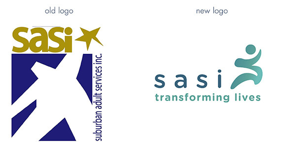
During his two decades at Manzella, Steve’s cleverly shaped the brand identity for a variety of organizations. Notably, he redesigned the logo for sasi. sasi is a local non-profit dedicated to providing support for individuals with developmental and intellectual disabilities.
When it comes to his work, the finished product doesn’t happen by accident. Each piece is meticulous and full of intention, as demonstrated below in his designer notes.

Designer notes: The sasi logo represents the brand with a friendly and proactive disposition. The Gotham Rounded font face is bold yet gentle and stands out even at smaller sizes. The “s”-shaped icon exudes a humanistic appeal and speaks to dignity, confidence, purpose and hope. It serves as a visual counterpart to the “transforming lives” tagline and sasi logotype whose widely spaced letters suggest steps taken, as the icon moves forward into the future.
Thanks for sharing the insight, Steve! Here’s to 20 years!


